Founded in 1847, Thuasne is a top French company, the leader in the medical textiles market. It has 1,800 employees and offers personalised, non-invasive healthcare solutions all over the world. After a partnership of more than 15 years, Thuasne once again commissioned us to rebrand its identity.
All the brand’s visual pillars were reviewed.
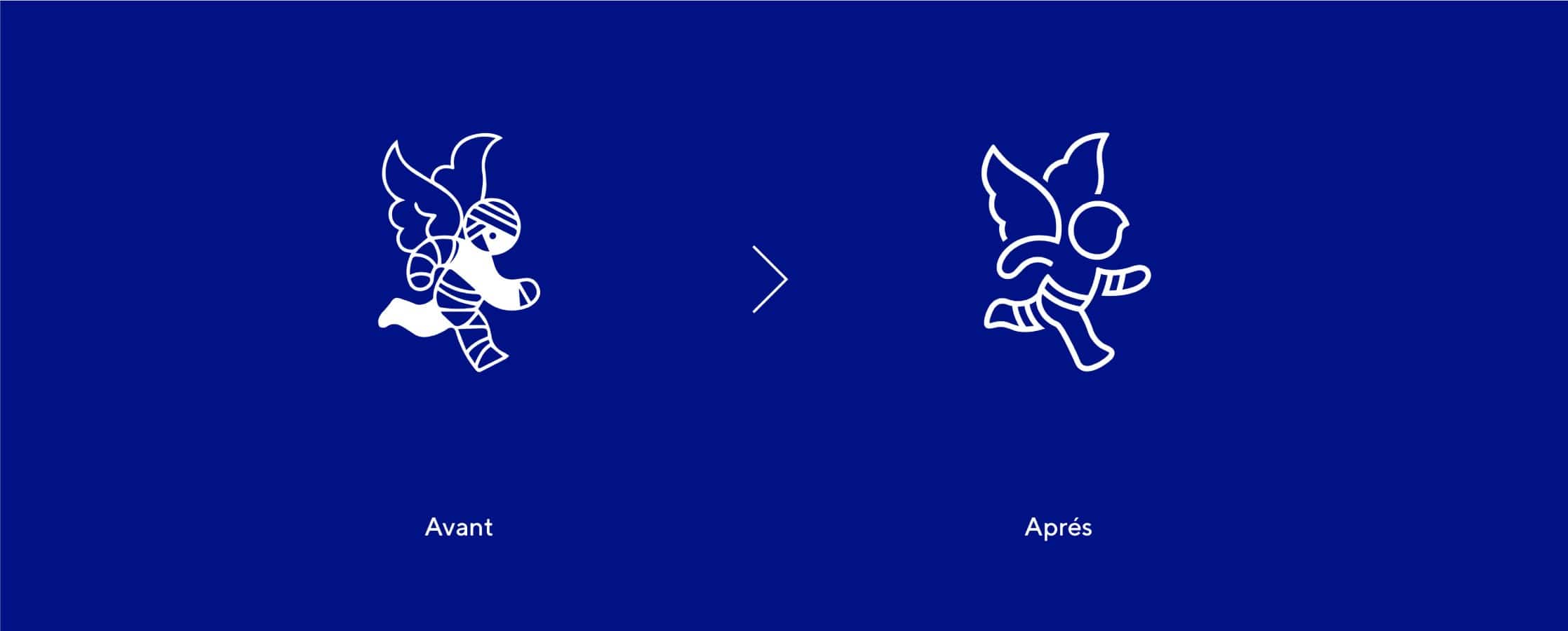
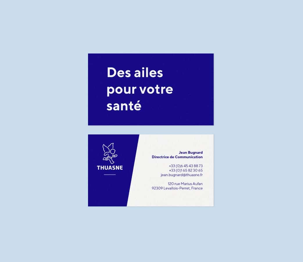
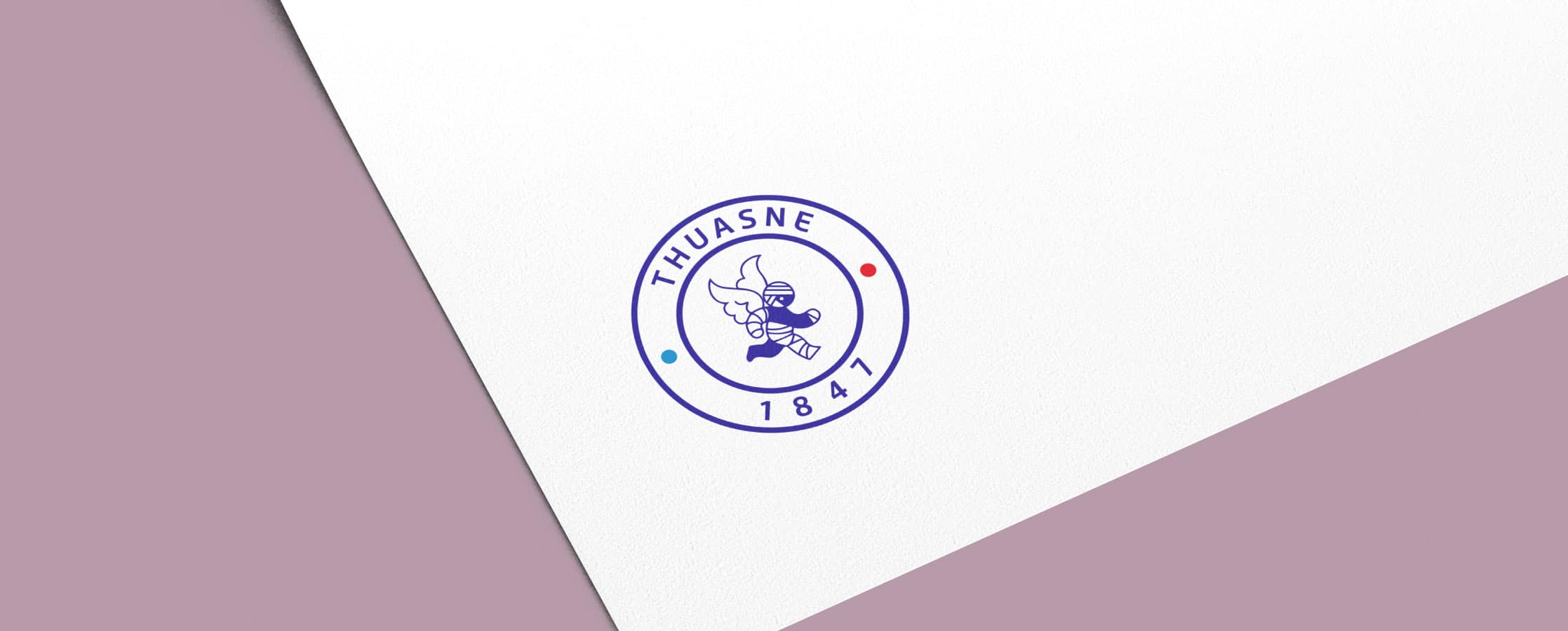
The famous little angel, a brand symbol for 60 years which has hardly changed since, was redesigned. We simplified and streamlined it, while retaining its lively, appealing nature. The new design is more open, consisting of a single line, like the thread in the brand’s textiles.
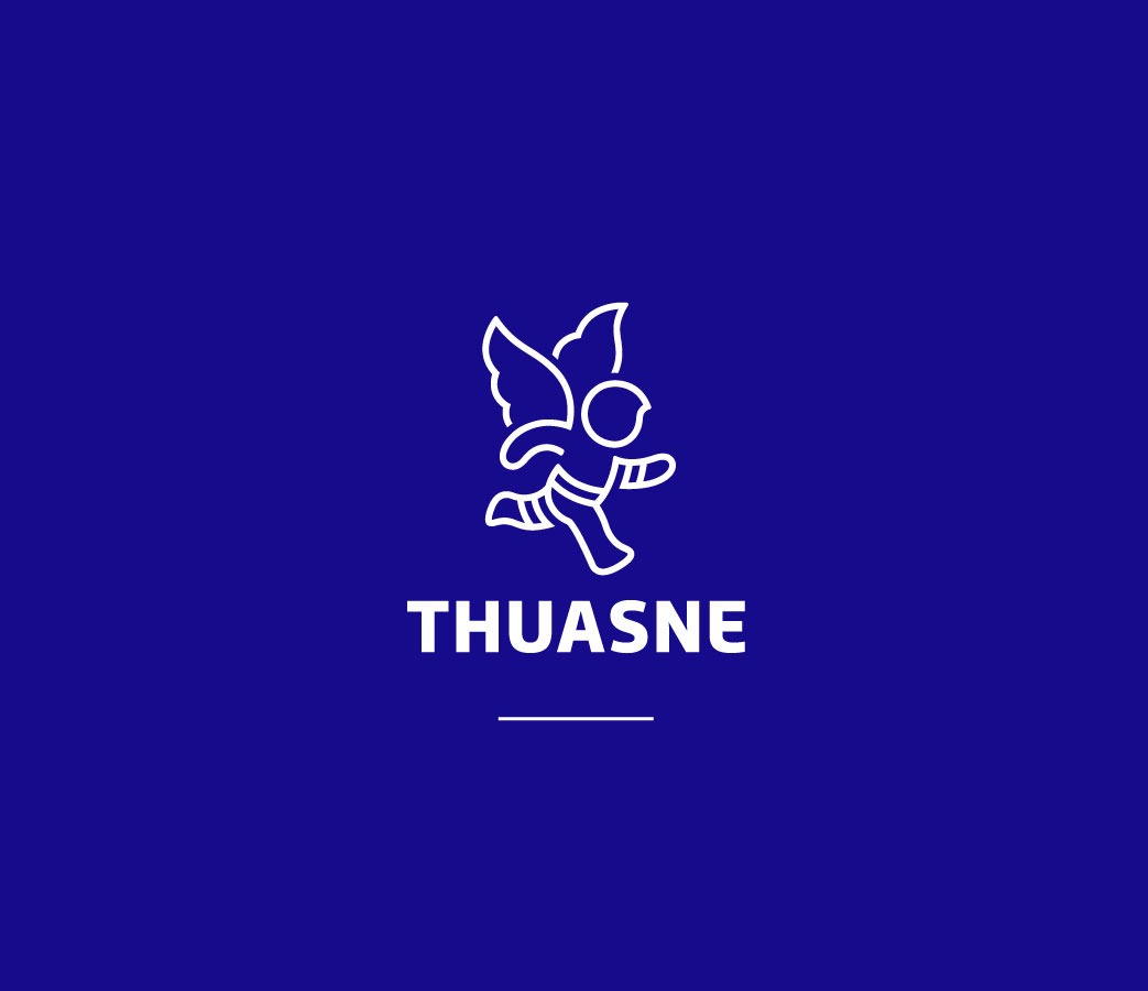
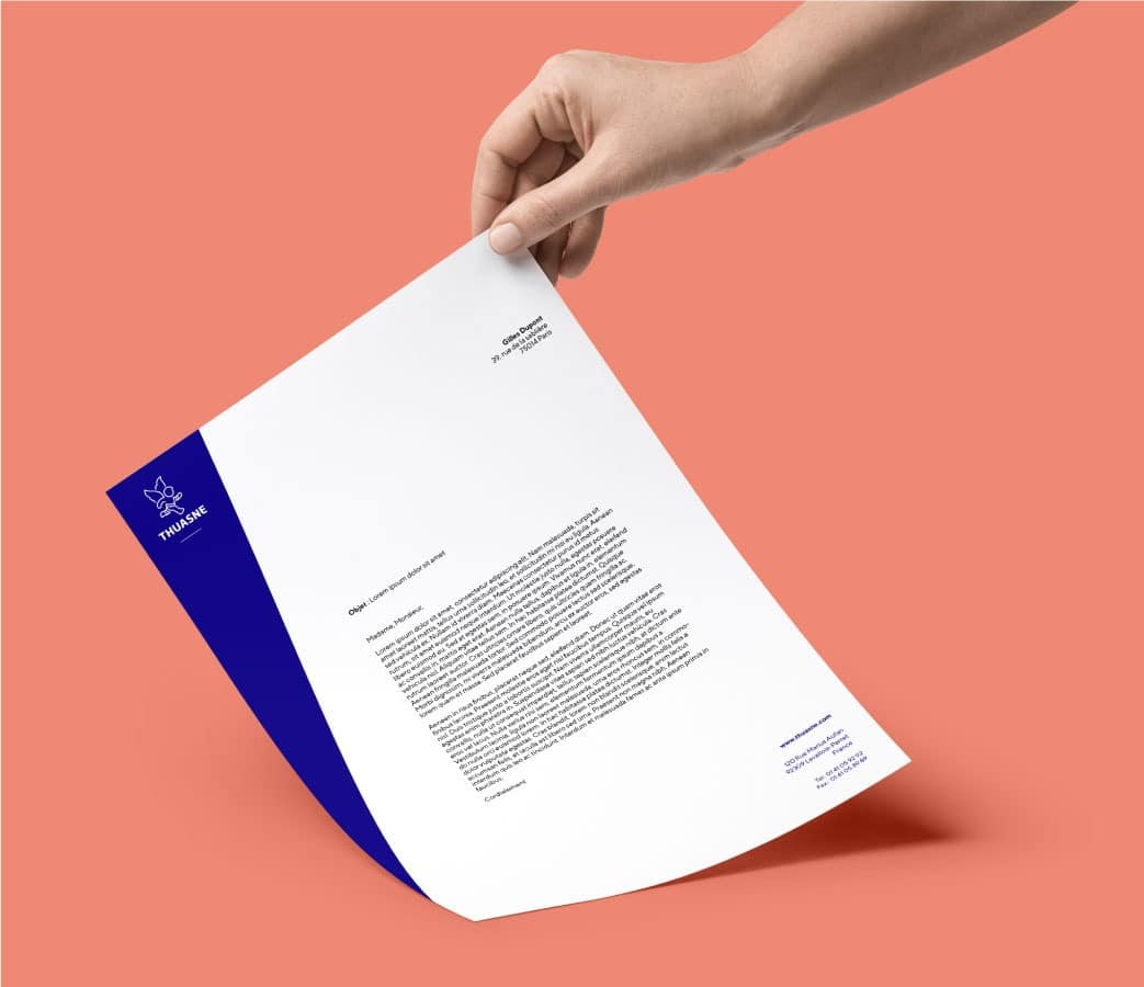
No longer with bandages on his head, he is full of life, running towards a new freedom. The new symbol, combined with a new typeface, is positioned on a Klein blue background, the brand’s historical colour, with slightly resized proportions. The development of the logo was also an opportunity to revamp the whole brand identity.
“Thank you for helping our teams to renew our brand. It’s an important, significant transformation.”
Elisabethe Ducottet,
CEO
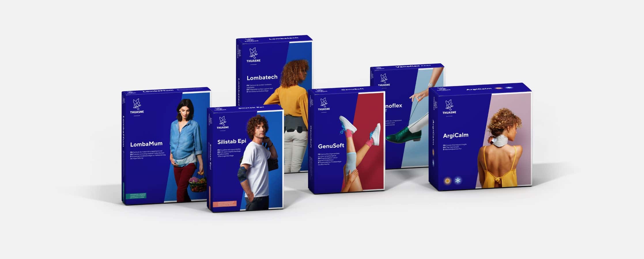
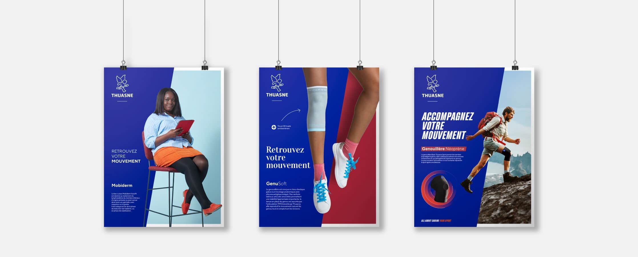
The Thuasne blue has been redefined, and is just as powerful but more elegant. The brand has been given a new dynamic, a 10° angle around which the whole identity is harmoniously developed.
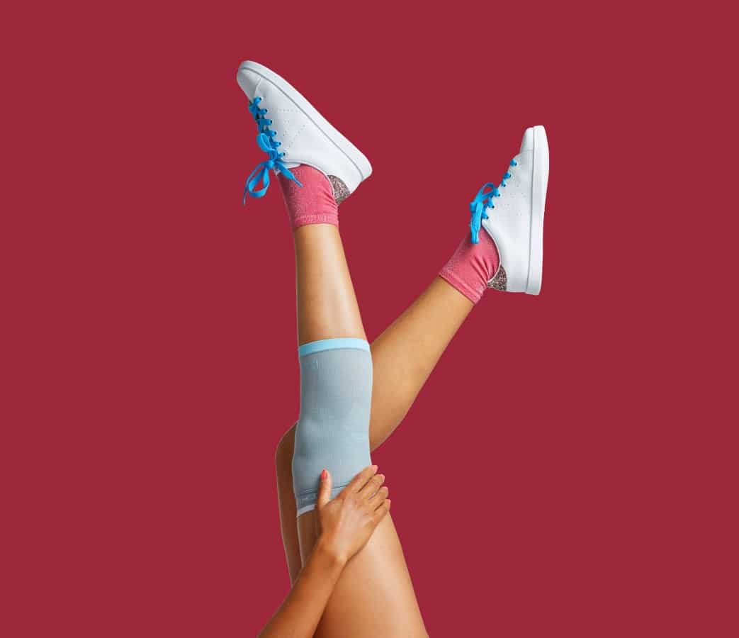
The iconography has also been redesigned to be more everyday, simple and joyful. A new, strongly contemporary visual identity in line with the Thuasne promise: giving wings, lightness and movement back to patients.
15
years loyalty to the agency
10
degrees : the Thuasne angle
2738C
the Thuasne blue
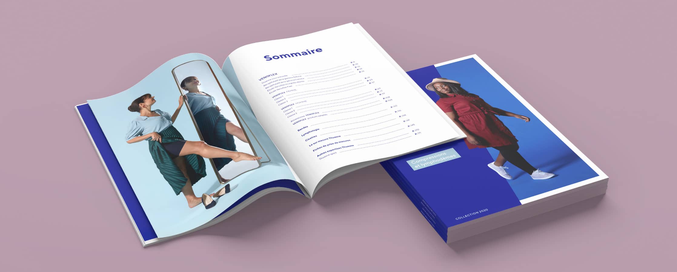
175
pages in the charter