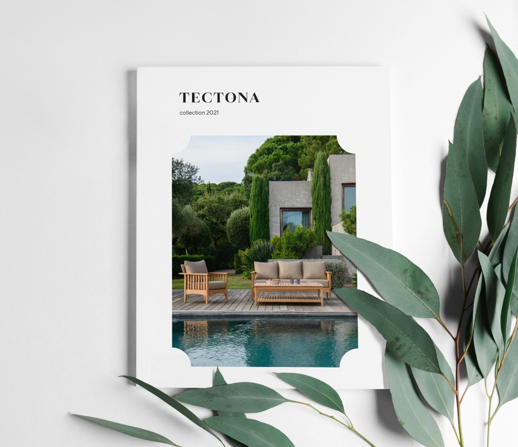
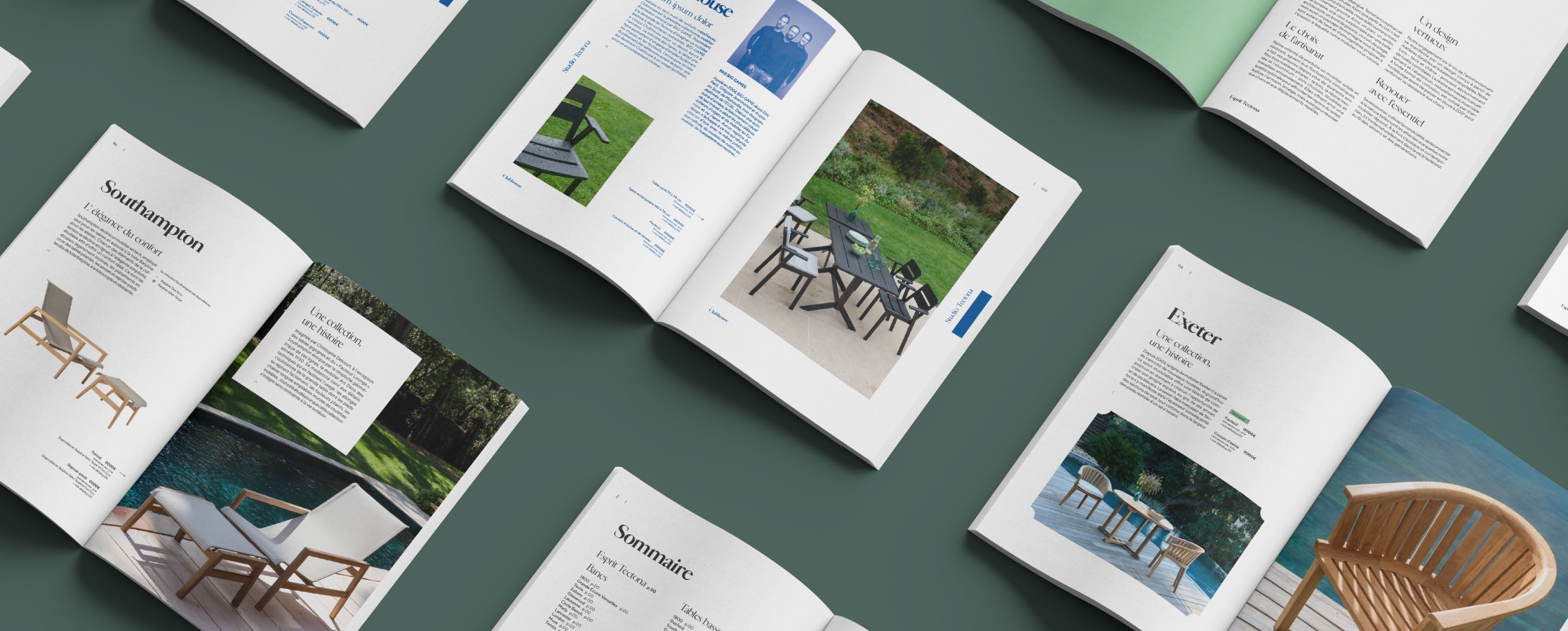
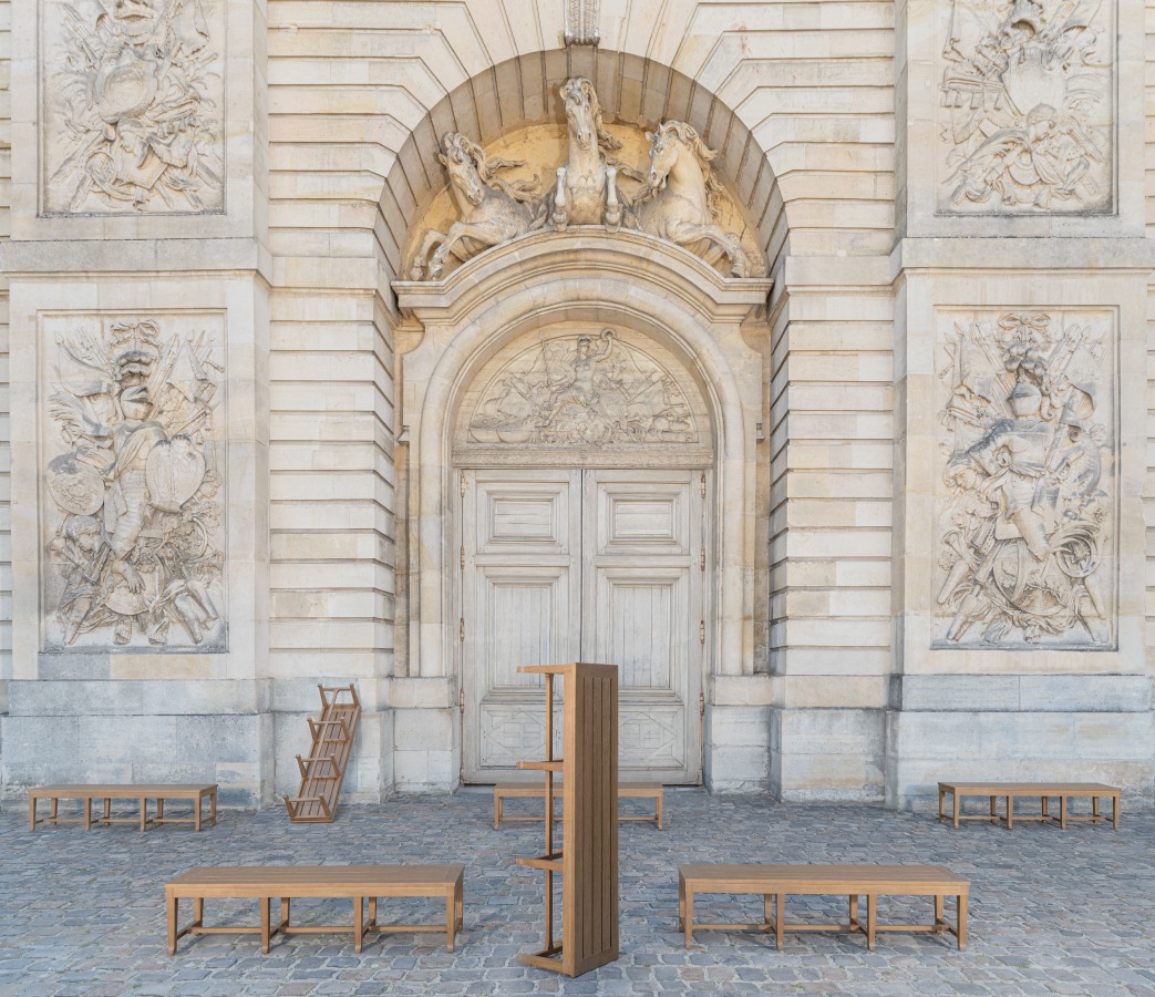
Born in the late seventies, Tectona is a major French garden furniture brand.
The Tectona style embracing both the classic and the contemporary is a benchmark.
From Andrée Putman to the Bouroullec brothers, Big Game to Julie Richoz, the brand inspires top designers whom it entrusts with the task of renewing its design repertoire.
Driven up to now by its products, the need was felt to take care of the brand itself, making it clearer, more solid and more coherent. Tectona turned to :pulp to implement this project.
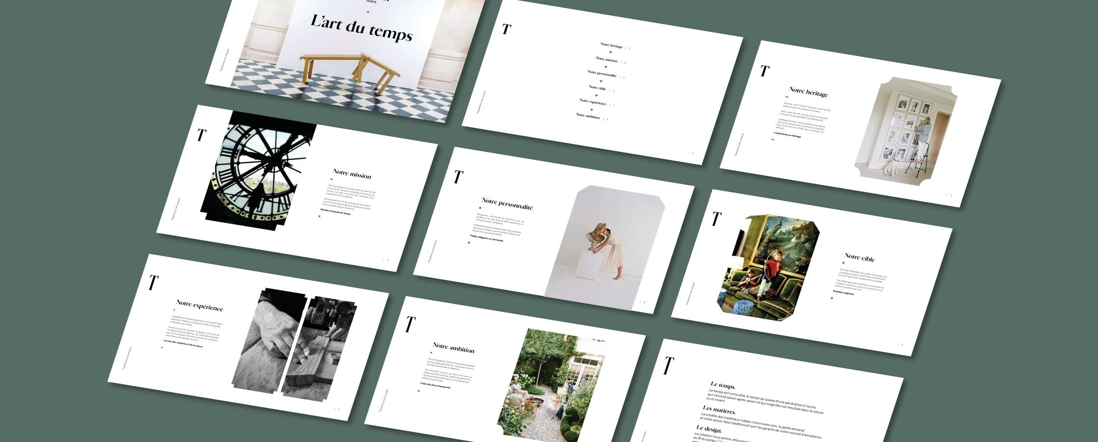
Following in-depth research, during which we carried out numerous interviews both internally and externally, organised workshops, analysed the customer pathways and their personae, :pulp redefined an entirely new brand platform for Tectona.
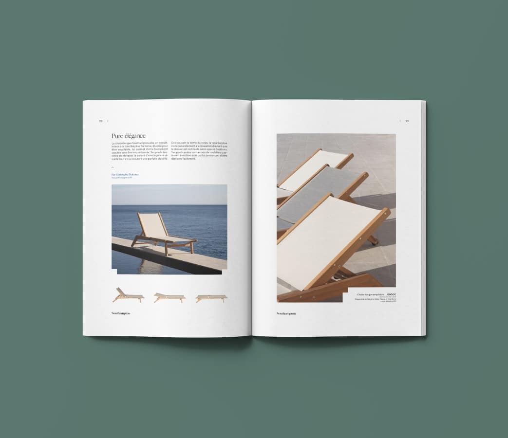
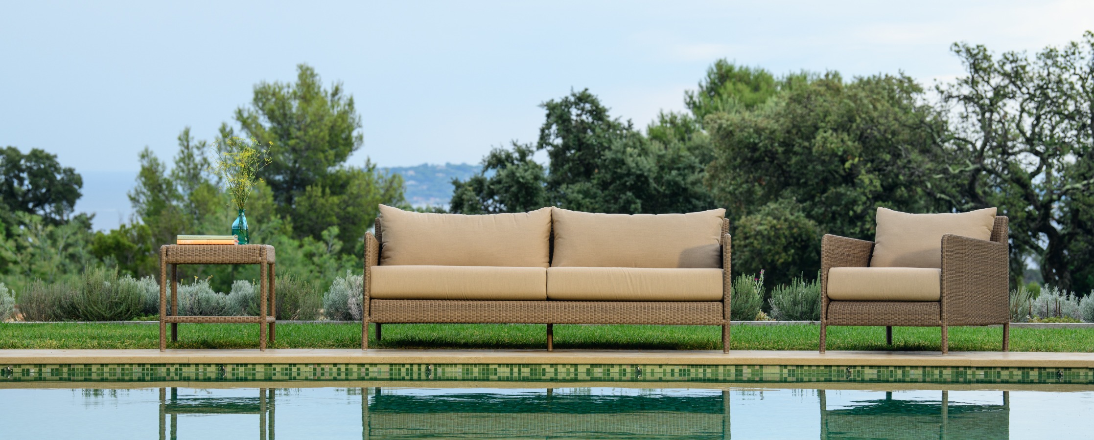
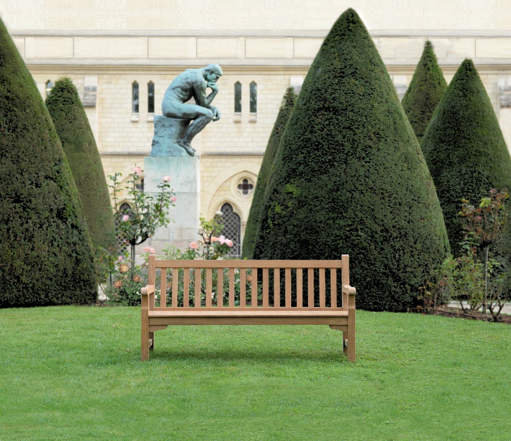
While nowadays nothing seems to be made to last any more, Tectona is renowned for the high quality of its products that only get better with each passing season.
We have made this idea of time the brand’s cornerstone.
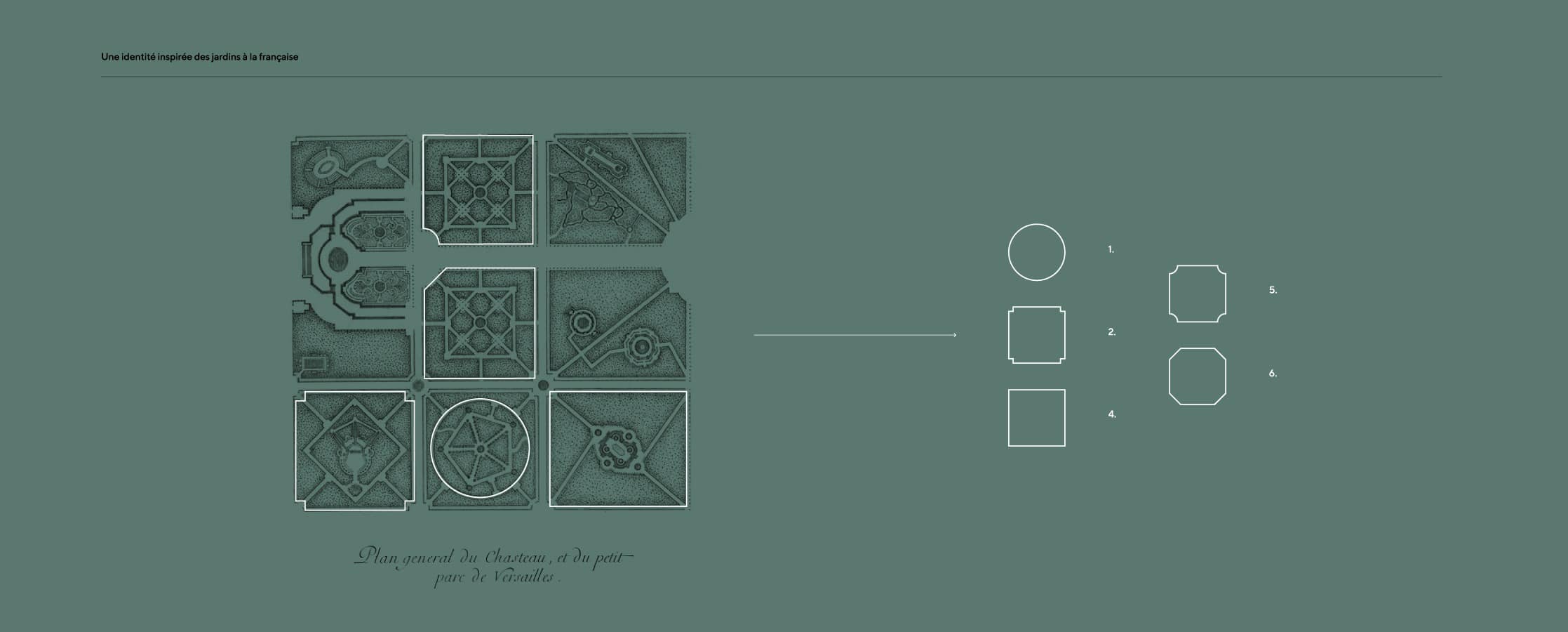
This new strategic momentum allowed the creative team to enthusiastically go on the hunt for a unique visual landscape, which took us to Versailles and Le Nôtre’s gardens. It was there that we found our inspiration: French-style gardens and their aesthetic vocabulary, what are known as broderie ornamental garden.
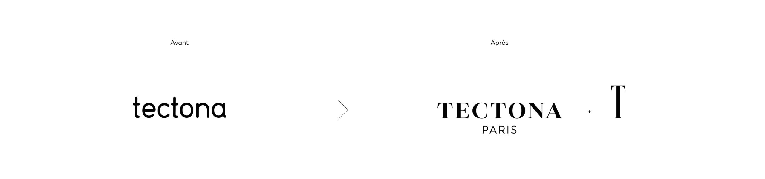
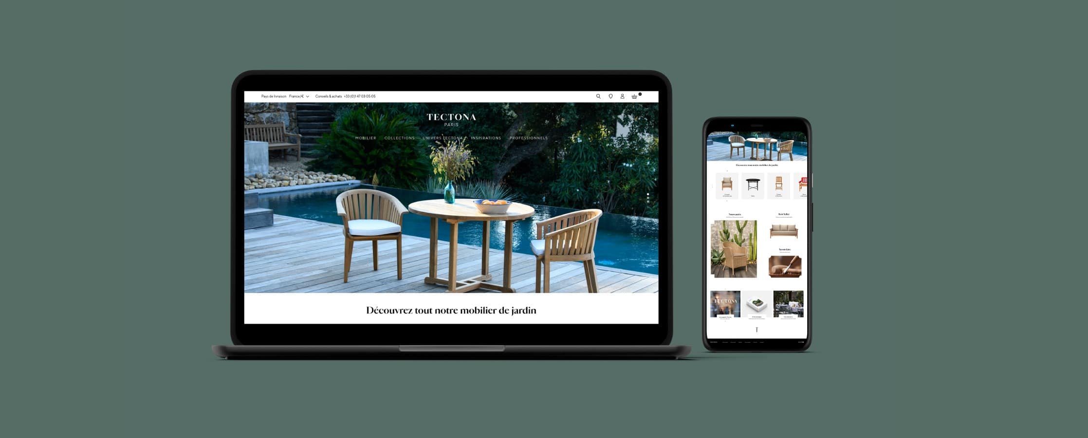
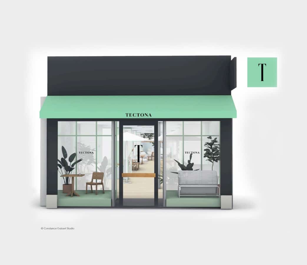
From this inspiration, we drew a contemporary graphic language for Tectona, making it possible to structure the entire brand identity around five shapes reminiscent of the design of flowerbeds and water features that interact and form endlessly new configurations. We wanted to pair this with a classically inspired font that was nonetheless extremely modern: Cardinal Photo, designed just recently by the talented French typographer Jean-Baptiste Levée.
This new visual landscape, a bridge between the classic and the contemporary, welcomes all the brand’s furniture with the same ease, from the most traditional to the most modern. It speaks pertinently to all customers: loyal customers whose feathers must not be ruffled and new, often younger customers who must be won over.
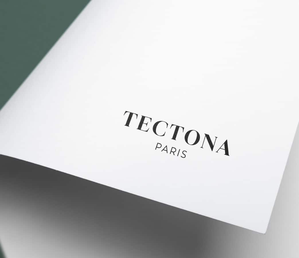
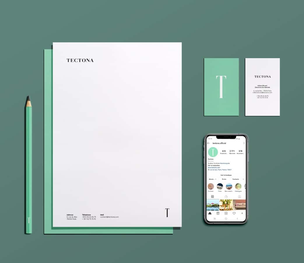
Last but not least, we had to find the right symbol for Tectona: elegant, simple and understated. A symbol that speaks for itself. We searched for it long and hard until it appeared: the big T.
T for time that passes and stretches out.
T for “Tectona Grandis”, the majestic tree from which they take the finest boards to make the finest furniture. T like a stamp, following in the footsteps of the great cabinetmakers. Tectona furniture proudly bears this symbol that attests to its authenticity.
T for “Tectona Grandis”, the majestic tree from which they take the finest boards to make the finest furniture. T like a stamp, following in the footsteps of the great cabinetmakers. Tectona furniture proudly bears this symbol that attests to its authenticity.
“:pulp was extremely attentive and perfectly understood the issues at stake for us. They designed a strong graphic identity that corresponds to our image, with which we and our customers can identify.”
Blanche Aloisi – Tectona’s Managing Director
1
Typogram
1
Symbol
1
Colour
5
Generic shapes