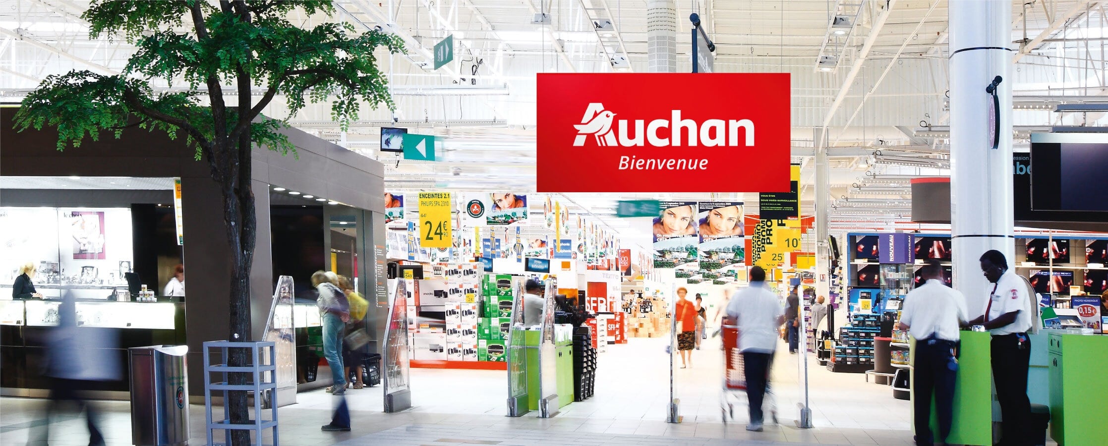
The Auchan brand is one of the leading retailers in the world. Its logo, created by Michel Disle, has not changed for 32 years!
In 2014, Auchan asked us to develop this logo to make it more modern and dynamic.
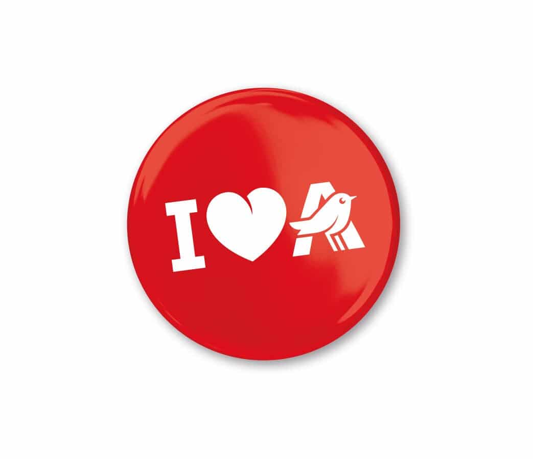
It was important to focus on the logo’s key elements: red, green and the bird in the A. The position of the bird, nestling in the A, was not changed as it conveys a strong meaning: the bird does not represent Auchan, it is at Auchan, “in the fields”, it feels good there and represents a link, an interface between the store and its customers.
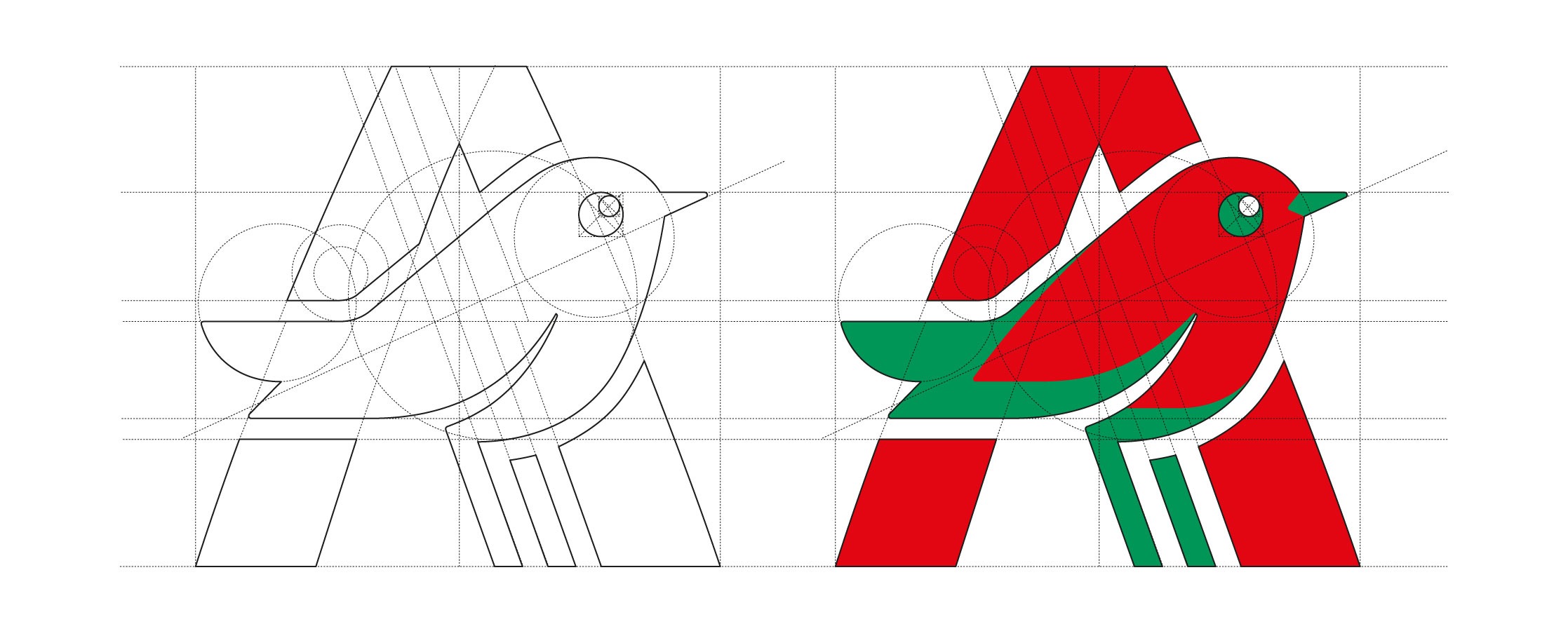
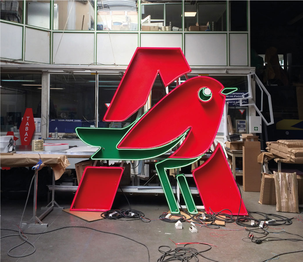
Subtly and gently, we developed this globally recognised, much loved logo. Our team particularly enjoyed being able to modernise the logo without changing it too radically. The new, simpler, rounder and brighter robin design was combined with a new typeface specifically produced in collaboration with Jean-Baptiste Levée, one of the most renowned French typographers.
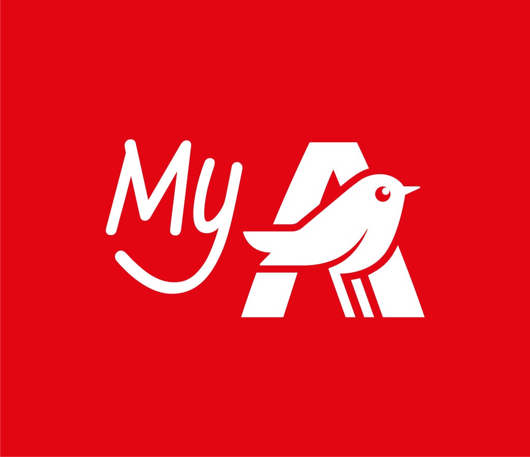
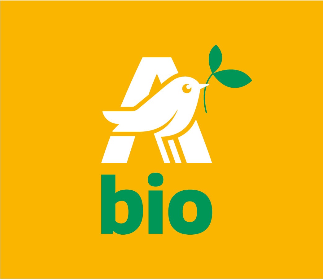
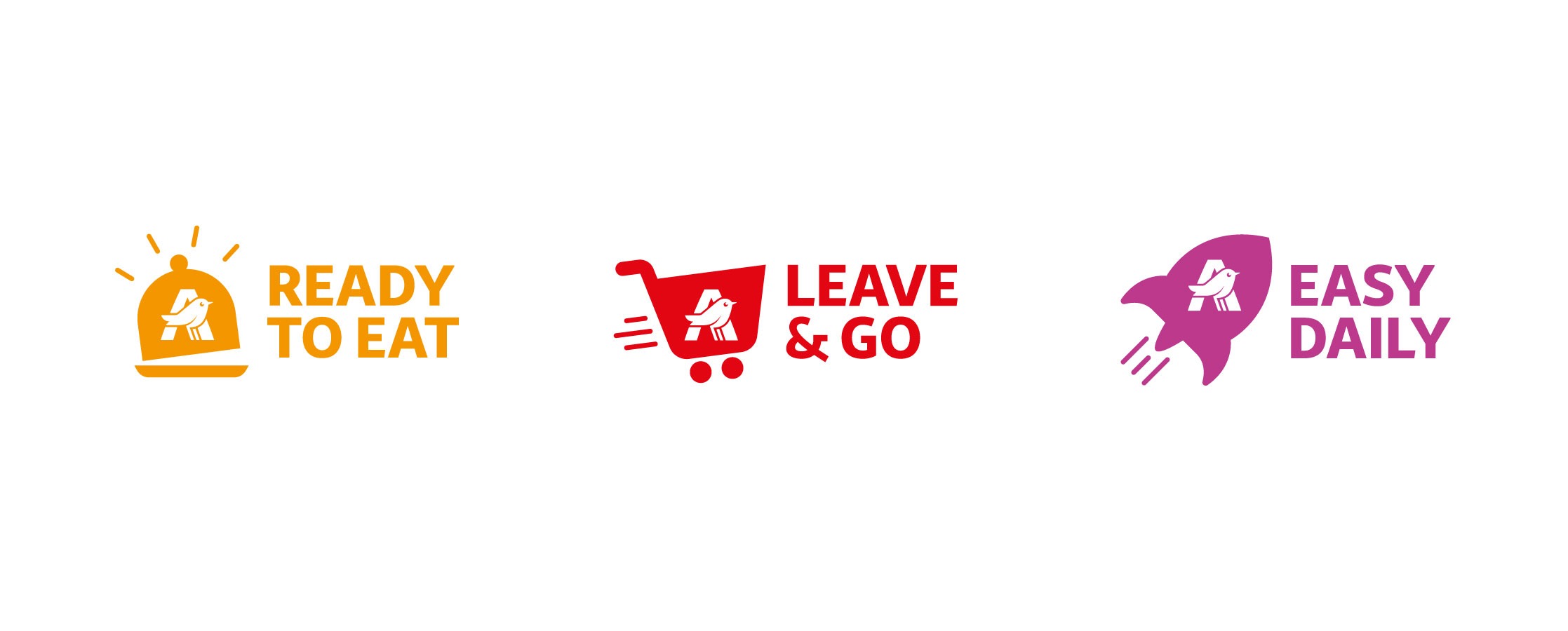
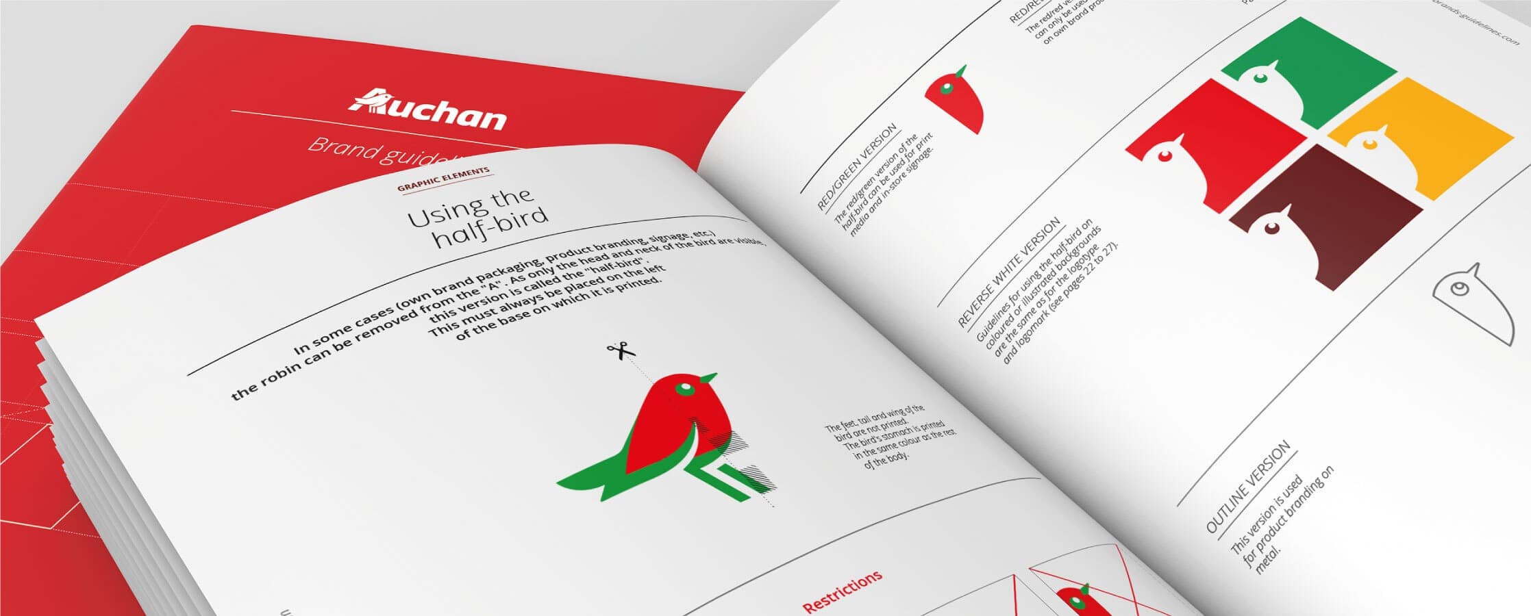
The development of the Auchan logo was supported by a new global visual identity. All these new graphic codes were compiled into a brand charter that will give strength and coherence to the Auchan brand all over the world, in its sales outlets, on the web, and in all its corporate or general public marketing materials.
100
customers questioned
18
months of work
80%
positive opinion
7
carts